
6 minute read · Colour and room decisions
Choose bathroom paint colours around the tiles, sanitaryware, flooring and fixed furniture that will stay. Compare physical samples beside those materials under both daylight and the bathroom lights. Then confirm a suitable coating for the actual painted surfaces and room conditions.
This guide is about the palette for a bathroom in Dundalk or nearby. If a ceiling is peeling, mould keeps returning or there is a leak, settle that assessment before treating the problem as a colour choice. A different shade does not resolve moisture.
Start with tile and fixture undertones
Tiles often cover more visible area than paint and are harder to change. Look at their background colour, pattern and grout together. A grey tile may sit beside warmer grout or a cream bath panel, so the room may not have one simple undertone.
Compare samples directly with the tile and sanitaryware. Two whites can make each other look different. A bright white wall may emphasise a cream basin; a warmer wall may make a cool tile appear more blue. Judge the actual relationship rather than trusting a white or stone colour name.
Choose an anchor if several materials compete. It may be the dominant wall tile or floor pattern. Decide whether the painted area should blend with that material, provide contrast or pick up a secondary colour. You do not need to reproduce every colour in a patterned tile.
Test colours in bathroom lighting
Check natural light through any obscure glazing, then turn on the normal ceiling and mirror lights. Their position may put different light on the wall sample and the tile. A sample beside the window does not represent the wall behind the door.
If mirror lighting is being replaced, make that choice before approving paint where practical. A colour judged under an old fitting may look different after the planned change. Include the artificial-light test even if the bathroom receives generous daylight.
Look at the sample vertically and at the intended ceiling relationship. A small bathroom may have little wall area, yet the ceiling is a large visible plane. Testing a white card only at eye level can miss that part of the scheme.
| Fixed materials | Restrained direction to test | Stronger direction to test | Watch for |
|---|---|---|---|
| Cream tiles and warm floor | Related off-white | Muted clay or deeper warm neutral | Unexpected yellow beside white fixtures. |
| Cool grey tile and white basin | Compatible pale neutral | Deeper blue or charcoal | Samples turning dull in limited light. |
| Patterned floor with pale walls | Quiet background | One tone drawn from the pattern | Too many competing accents. |
| White tile and timber vanity | Soft neutral related to timber | Green-blue or other deliberate contrast | Difference between daylight and mirror light. |
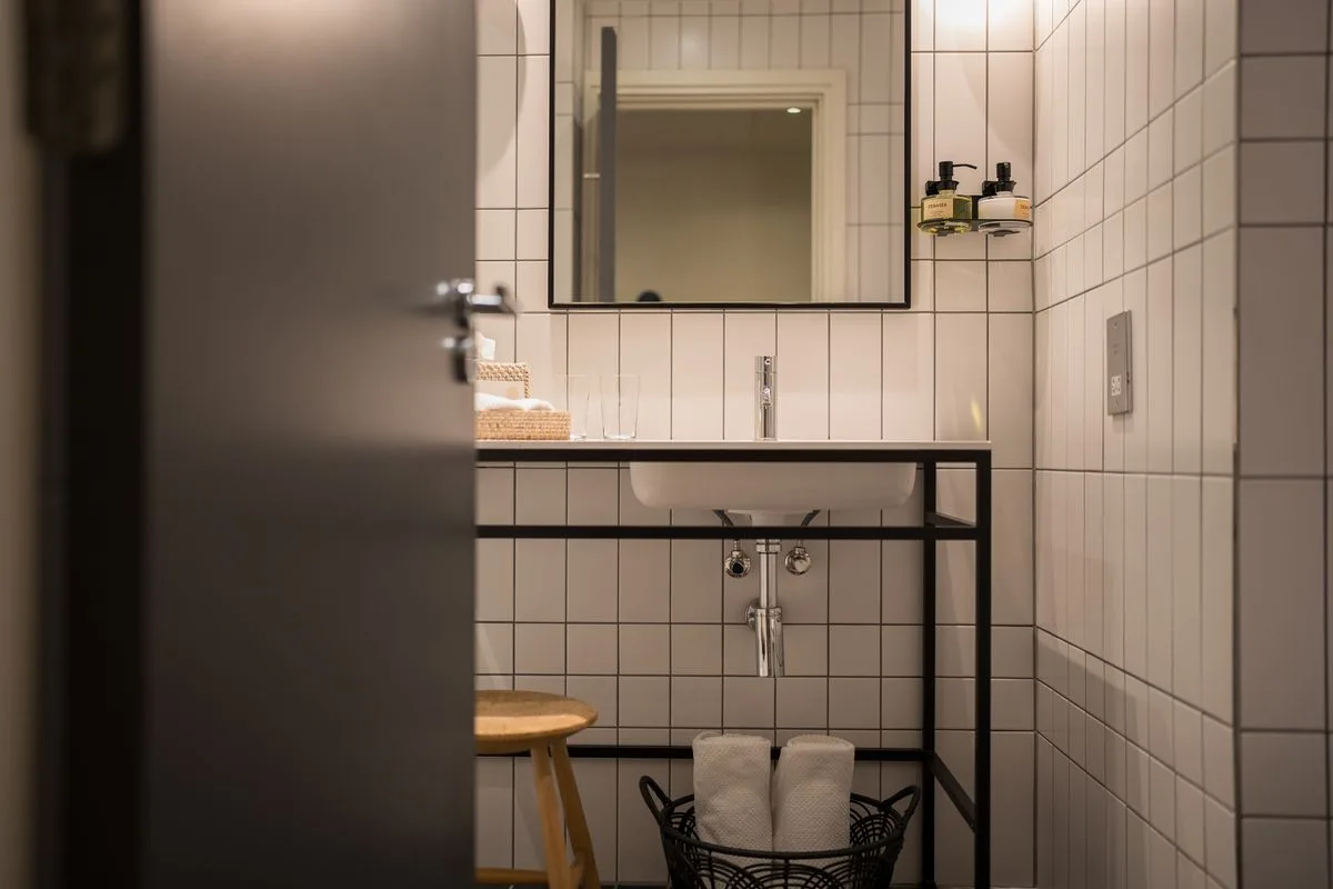
Coordinate walls, ceilings and trim
List the painted surfaces: upper walls, ceiling, door, architrave, skirting if present and any existing decorative detail. Decide whether the ceiling remains separate or joins a related scheme. A stronger wall beneath a pale ceiling gives a different boundary from the same colour across both.
Compare trim with nearby tile edges and sanitaryware. A default brilliant white can be right, but it should be chosen rather than assumed. A related off-white or deeper trim is another option, subject to appropriate coating suitability.
Sharing a colour does not establish that one product suits every substrate. The Little Greene bathroom guide provides separate finish advice for walls and woodwork. Its examples are product-specific, not proof that every eggshell or matt is suitable in any bathroom.
Compare restrained and stronger palettes
A restrained palette can leave tile pattern, fittings or a view as the main focus. It does not have to mean pure white. A related pale neutral may connect the materials with fewer visible changes, depending on the actual undertones.
A stronger painted colour can be useful where the tiles are plain or only part-height. It creates a clearer painted area and can make white sanitaryware stand out. Test the full relationship, because a small dramatic sample may become a larger presence when it covers every upper wall.
Irish retailer Pat McDonnell Paints offers bathroom colour inspiration. Use such examples to identify directions you like, then verify them with your own tiles. A photographed room is not a reliable colour match for another bathroom.
A hypothetical tiled-bathroom comparison
Imagine a compact bathroom with cream wall tiles, white sanitaryware, dark floor and little daylight. Candidate A is a crisp white, Candidate B a pale warm neutral and Candidate C a muted deeper green-blue. Compare each against the cream tile and white basin together.
A might look clean in isolation but make the tile appear more yellow. B may connect the tile while reducing contrast, or look too creamy under the mirror light. C may give the intended contrast, but needs checking across the upper wall and with the dark floor. None can be approved from those descriptions alone.
After choosing a leading candidate, test the proposed ceiling and trim colours with it. Do not buy the complete system until you know which surfaces share the shade and whether suitable products provide that colour in the needed finishes.
Keep colour separate from moisture and finish diagnosis
If there is peeling or a recurring mark, establish why. An active leak, condensation pattern or unstable old coating is a different task from choosing a palette. A product described as moisture resistant does not replace ventilation or repair water entry.
Our bathroom paint and peeling-ceiling guide covers that diagnosis boundary. Use choosing paint colours for the broader sample method and small-room colour decisions when you want to compare continuity and contrast in a compact bathroom.
For interior painting in Dundalk and nearby areas, send current photographs, your area and the surface list. Photos start the discussion; a visit may be needed. State clearly that tiles, vanity or fixtures are staying so the painting scope and palette can be considered around them.
Questions before you decide
Should the paint exactly match the tile background?
An exact-looking match is one option, but related or contrasting colours may suit the room better. Compare the physical sample with grout and sanitaryware too, since those may have different undertones. Two nearly matching whites can look unintentionally different under bathroom lights. Decide whether you want continuity or contrast, then test that relationship rather than assuming a tile-colour match is the only coordinated choice.
Can a small bathroom have a dark painted ceiling?
It can be a deliberate design choice if you like the appearance with the tiles, fixtures and lighting. Test suitable samples and consider the full overhead area, not only a tiny wall swatch. Do not rely on a promise that it will make the room feel larger or cosier to everyone. Confirm the appropriate coating separately, especially where there is an existing moisture or peeling problem.
Should colour be chosen before fixing a peeling bathroom ceiling?
You can shortlist colours, but first establish why the coating is failing and what the surface needs. A new colour does not resolve condensation, leaks or an unstable old layer. The diagnosis can affect preparation, coating selection and timing. Keep that work separate from the palette comparison, then approve suitable physical samples once the intended system and any lighting changes are understood.
Interior painting: discuss your surfaces and scope. Contact the team with your area and photographs.